Manufacturing Jobs
Here are some maps on employment in the manufacturing sector over the last decade or so.
info@dataproject.me
US relative manufacturing employment map over time
This animation shows the relative number of employees in manufacturing vs 1999
US manufacturing employment map over time
This animation shows the number of employees in the manufacturing sector

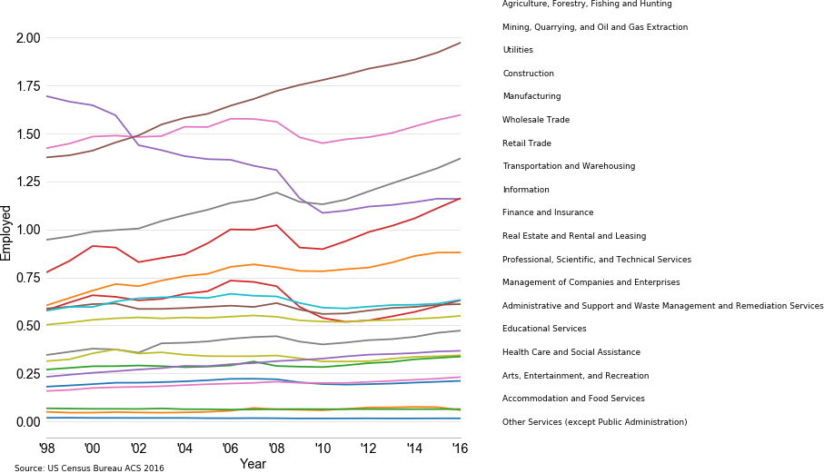
Employment by Industry
This plot shows employment by industry as reported by the Census Bureau's CBP
US relative manufacturing employment map over time
This animation shows the relative number of employees in manufacturing vs 1999
US industrial composition over time
This animation shows the relative contributions of US industrial sectors over decades